Client project · Ocean innovation

Blue Economy Israel

2024 · Client project · WordPress

I designed and built a responsive WordPress site that gives visitors clear ways into the centre’s work across ocean sectors, initiatives and events.
My role

Sole designer & developer · UX/UI · WordPress

The organisation

Israeli National Center of Blue Economy

Project focus

Content hierarchy · Navigation · Responsive design

Blue Economy Israel redesigned homepage with underwater turtle imagery and a row of sector navigation icons

A broad mission.
A clearer way in.

  • Keep: credibility for a government-supported institution.
  • Introduce: a modern, approachable and more playful digital presence.
  • My role: sole designer and developer — UX/UI, visual design and WordPress.
  • Feedback: supervising VP, content team, account manager and client.

Three directions.
One selected.

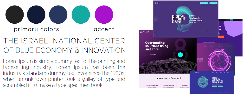
  • Explore three typography and colour directions.
  • Balance technology, sustainability and innovation.

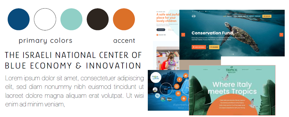
Client selection: Direction 02.
Ocean blue + pale mint + orange.

01 · Digital & expressive

Technology-led · Dark blue, turquoise and purple

02 · Selected direction

Selected direction · Ocean blue, pale mint and orange

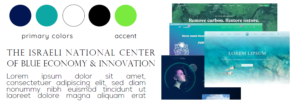
03 · Nature & sustainability

Nature-led · Navy, turquoise and bright green

Original direction boards · Reference imagery for the proposed look and feel

Layout breakdown · Reconstructed from the design

Organising the content before styling

A homepage overview and labelled sector links create a clear route into the centre’s work.

Content structure

Blue Economy Israel
Areas of activity
Initiatives
Sector pages and related content

Visitors can start with a broad topic and continue to the work connected to it.

Homepage hierarchy

Header · Main navigation
Mission + primary action
Sector entry
Sector entry
Initiatives + supporting content

The mission establishes context. Labelled entries make the next step visible.

Why blue
and orange?

  • Blue: connects the interface to the sea.
  • Orange: highlights actions and key information.

Institutional confidence with a more energetic visual character.

From visual direction
to interface.

  • Ocean imagery leads the opening screen.
  • Compact navigation separates the main areas.
  • Orange highlights the event action.
  • Labelled icons introduce the ocean sectors.
  • A shared format connects aquaculture, energy, biotechnology and more.
Category navigation detail from the Blue Economy homepage screenshot
Sector navigation detail from the delivered homepage.
1. Understand the missionThe opening frames the centre’s work in ocean innovation.
2. Choose a sectorLabelled icons surface topics such as aquaculture, energy and biotechnology.
3. Explore the topicThe chosen sector gives visitors a more specific entry into the centre’s work.
Explore Aquaculture on the current client site ↗
The client has updated the website since the 2024 delivery. The screenshots above document the version I designed and built.

Design and build,
connected.

From content structure to a responsive WordPress website:

01 · Structure

Organise the content

Organise initiatives and sectors into a clear navigation hierarchy.

02 · Visual system

Give the mission a voice

Connect imagery, colour, type and icons into one interface language.

03 · Implementation

Carry it into WordPress

Build responsive layouts with content managed through WordPress.

The delivered
experience.

  • Selected visual direction carried into the website.
  • Connected navigation, sector categories and content layouts.
  • Responsive WordPress implementation.

Ocean-led imagery · Labelled sector navigation · Clear orange actions

Delivered · A responsive WordPress website with a labelled sector index, a shared visual system and editable content layouts.

My contribution · Content hierarchy, UX/UI, visual direction and WordPress development.

© 2026 Shani Hakak