Client project · Digital PR · c. 2022

Percepto Digital

I led the visual direction, page design and responsive build. The decision was to keep Percepto’s recognisable logo and change how the site explained the agency’s offer. I gave services and client work clearer paths, then carried the same hierarchy across the homepage, service pages and case studies.

My role

Sole designer & developer · Website rebranding · UX/UI

Context

Digital PR agency · Tel Aviv

Shown here

Responsive agency website · Homepage, services and case studies

A new language.
The same identity.

  • Keep: the existing logo and recognisable identity.
  • Change: a traditional website into a more sophisticated digital presence.
  • My role: sole designer and developer — UX/UI, visual design and implementation.
  • Feedback: supervising VP, content team, account manager and client.

From restrained

to more expressive.

  • Before: monochrome palette, centred message and fine-line graphics.
  • After: vivid mint, bolder sections and stronger visual hierarchy.

Original project screens · Before and after

Before · Previous website

A quieter visual identity

A centred positioning statement and fine-line graphics introduce the agency. The navigation blends into the monochrome header.

After · Website rebrand

A more distinctive presence

A mint header makes the navigation distinct. Team photography and a short headline introduce the agency before visitors reach the service overview.

Three design decisions

Three decisions shaped the rebrand:

01

Give colour a clear role

  • Mint highlights navigation and content cards.
  • Black and white balance the vivid accent.
02

Strengthen the hierarchy

  • Separate introduction, services and editorial content.
  • Use prominent headings to guide scanning.
03

Connect the page family

  • Extend the palette and typography across page types.
  • Adapt layouts for smaller screens.

The homepage

in motion

Homepage in motion · Navigation, services and content sections

Percepto Digital website redesign — still from the homepage
Homepage walkthrough from the original project presentation.

Layout breakdown · Reconstructed from the design

Designing a family of pages

The homepage introduces the agency’s services. The case-study page carries the same hierarchy into a longer story.

Agency homepage

Navigation
Positioning + primary action
Services
Capabilities
Selected work + agency content

Large section headings break the offer into a sequence visitors can scan.

Case-study page

Navigation
Project title + introduction
Context
Approach
Project visuals + details

The project gets a clear introduction before the supporting visuals and details.

Beyond the homepage

  • Extend the identity into long-form case studies.
  • Compare the earlier page with the redesigned layout.
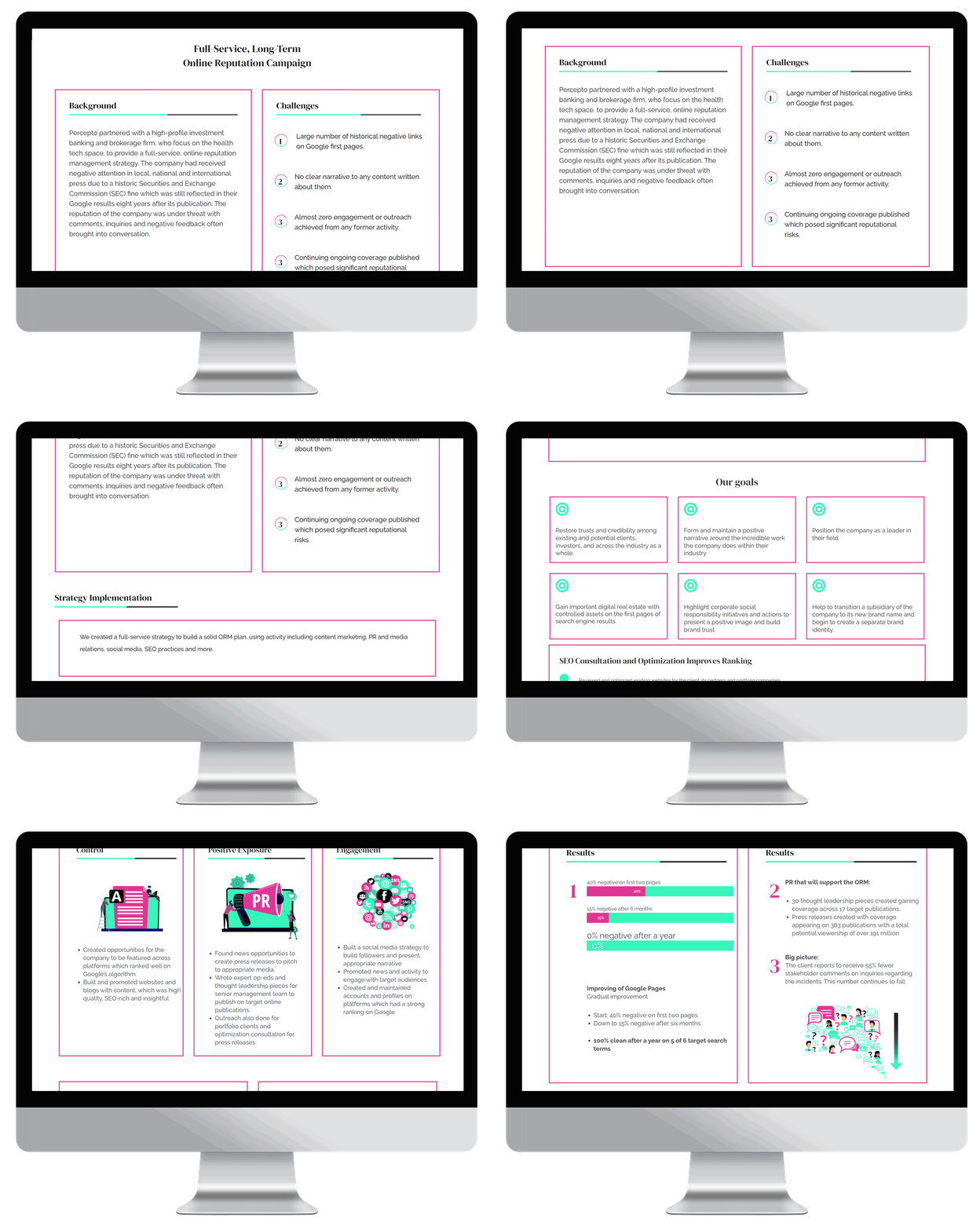
Earlier case-study page
Earlier Percepto case-study page from the existing project materials
Redesigned case-study page
Animated walkthrough of the redesigned Percepto case-study page

A connected
page family.

  • Homepage: establish the visual direction.
  • Case studies: carry it into longer content.
  • Shared system: mint, graphic shapes, typography and content blocks.

A consistent visual language across agency, service and editorial content.

Delivered · A responsive agency website with a shared visual system across the homepage, service pages and case studies.

My contribution · Visual direction, UX/UI and responsive development. Screens are from the original project presentation.

© 2026 Shani Hakak