Case Study:
Israeli National Center of Blue Economy Website Redesign

Project Overview

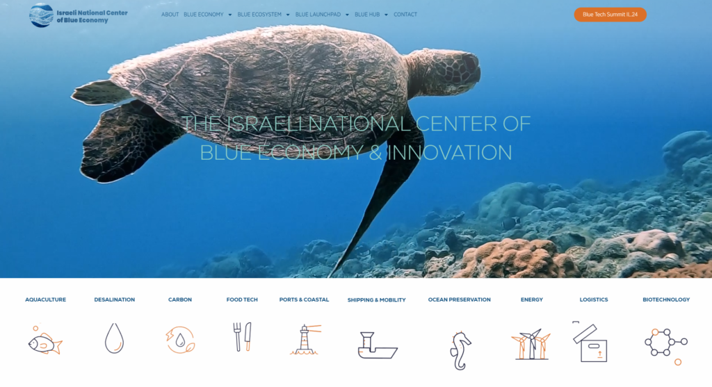
The Israeli National Center of Blue Economy wanted to reimagine their online presence to better reflect their innovative approach to sustainable ocean resource management. Their existing website was outdated, visually unappealing, and lacked effective navigation, which hindered stakeholder engagement.

The goal was to create a modern, creative, and responsive website that highlights the organization’s mission, improves user engagement, and provides an enhanced user experience.
Project Objectives

01

Enhance User Experience
Increase usability and ensure easy access to key information.

02

Modern Aesthetics
Create a visually compelling design aligned with the organization’s vision

03

Boost Engagement
Encourage user interaction and extend session durations.

04

Responsiveness
Ensure compatibility across all devices for a seamless user experience.

Challenges

  1. Outdated Design: The previous website lacked visual appeal and failed to communicate the organization’s innovative mission.
  2. Poor Navigation: Key information was buried in submenus, making it difficult for users to find relevant content.
  3. Lack of Engagement Tools: The old website lacked features like calls-to-action (CTAs), multimedia content, and modern interactivity.

Process

Step 1

Discovery & Research

Stakeholder Interviews: Engaged with the team to understand their goals, target audience, and expectations.

Competitor Analysis: Reviewed similar organizations’ websites to identify best practices and opportunities for differentiation.

User Surveys: Collected feedback from users of the old website to identify pain points, which informed design improvements.

Step 1

Step 2

Wireframing & Information Architecture

  • Simplified Navigation: Redesigned the menu structure to prioritize frequently accessed content.
  • Wireframes: Created low-fidelity wireframes to map out user journeys, ensuring an intuitive flow.
  • Call-to-Action Placement: Strategically positioned CTAs to encourage user engagement and content exploration.
Step 2

Step 3

Visual Design

  • Creative Branding: Integrated modern typography, a clean layout, and a cohesive color palette inspired by the ocean and sustainability.
  • Custom Imagery: Highlighted impactful visuals, such as high-quality images and illustrations, to emphasize the organization’s mission.
  • Multimedia Content: Added videos and infographics to make the content more engaging and digestible.
Step 3

Step 4

Development

  • Responsive Design: Built the website using a mobile-first approach, ensuring optimal performance across devices.
  • Optimized Performance: Implemented code and image optimizations, reducing load times significantly.
  • CMS Integration: Used WordPress to empower the team with easy content updates and management.
Step 4

Step 5

Testing & Launch

  • Usability Testing: Conducted testing sessions with stakeholders and target users to identify and address any usability issues.
  • Post-Launch Monitoring: Analyzed user behavior using tools like Google Analytics to measure success and identify further improvement areas.
Step 5

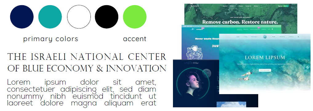
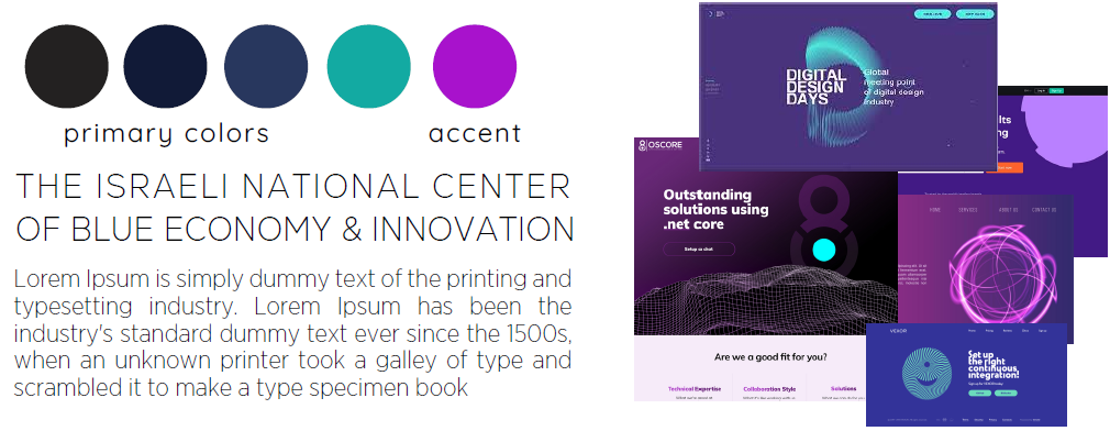
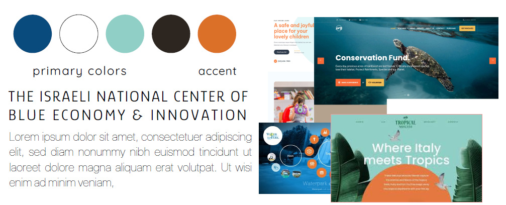
Font and Color Options

To ensure the design aligned with the organization’s goals, three font and color options were presented. Each option emphasized a different aspect of the Blue Economy’s mission: professionalism, environmental sustainability, and innovation.
 

01

02

03

The client selected Option 2, which incorporated vibrant orange accents alongside modern typography. This option stood out for its ability to blend trustworthiness with creativity, perfectly capturing the organization’s innovative and forward-thinking approach.

Creativity with Professionalism:
The vibrant orange accent reflected the organization’s innovative spirit while maintaining a professional appearance through deep blues and neutral tones.

User Engagement:
Orange is a color associated with enthusiasm and action, making it ideal for driving user engagement on CTAs, links, and interactive elements.

Visual Hierarchy:
The clear contrast between blue and orange helped guide the user’s eye through the site, ensuring key messages and actions stood out.

Brand Alignment:
The colors and fonts aligned with the Blue Economy’s mission to combine innovative solutions with sustainability.

Key Features

  • Streamlined Navigation: Improved accessibility to key information, reducing the number of clicks needed to find content by 40%.
  • Interactive Design: Included multimedia elements, such as videos, carousels, and hover effects, to engage users.
  • Responsive Layout: Fully optimized for mobile, tablet, and desktop use, ensuring a consistent experience across devices.
  • Creative Storytelling: Presented the organization’s initiatives through compelling visuals and narratives.

Results

  • Improved UX: User experience scores increased by 35% based on post-launch surveys.
UX Experience increased by
35%
  • Improved UX: User experience scores increased by 35% based on post-launch surveys.
  • Engagement Boost: Session durations increased by 50%, and bounce rates dropped by 30%.
  • Responsive Success: Mobile traffic accounted for 60% of total visits post-launch, demonstrating the importance of a mobile-first design.
  • Stakeholder Feedback: Received highly positive feedback on the design, usability, and alignment with the organization’s mission
Session Increase
0 %
Session Increase
0 %

Conclusion

The redesign of the Israeli National Center of Blue Economy’s website successfully transformed their online presence, aligning with their mission and engaging their audience. The modern, creative design combined with an intuitive user experience has significantly boosted the site’s usability and stakeholder satisfaction.