Case Study:
Nathalie Lété Website Rebranding

Project Overview

Nathalie Lété is a celebrated multidisciplinary artist known for her vibrant, folk-inspired illustrations and unique handmade designs. Her website is the hub for showcasing her art, selling products, and sharing her creative journey. However, the original site lacked a cohesive visual identity and user-friendly navigation.

Role: Creative lead, UX/UI Senior Designer
Duration: 6 Weeks
Goal

To reimagine Nathalie Lété's official website to better reflect her whimsical artistic style while improving user experience and engagement.

Challenges

01

Visual Mismatch
 The existing site didn’t capture the playful and eclectic spirit of Nathalie Lété’s work.

02

E-commerce Functionality
 Navigation and product filtering were unintuitive, leading to a suboptimal shopping experience.

03

Content Discovery

Visitors struggled to explore Nathalie’s portfolio and learn about her artistic journey.

04

Mobile Responsiveness
The old website was not fully optimized for mobile devices.

Objectives

  1. Develop a website that embodies Nathalie Lété’s artistic aesthetic.
  2. Improve navigation and make the e-commerce experience seamless.
  3. Create a storytelling-driven design to showcase her portfolio and artistic journey.
  4. Ensure a fully responsive and accessible design.

Process

Step 1

Research & Discovery

  • Stakeholder Interviews: Conducted interviews with Nathalie and her team to understand brand values, goals, and target audience.
  • User Research: Analyzed user feedback from the existing website to identify pain points.
  • Competitive Analysis: Examined artist websites and art e-commerce platforms to gather inspiration and industry best practices.
Step 1

Step 2

Ideation & Strategy

  • Design Goals: Create a whimsical yet professional aesthetic to capture the essence of Nathalie’s art.
  • User Journey Mapping: Defined key user paths (e.g., browsing artwork, purchasing products, learning about the artist).
  • Site Architecture: Streamlined navigation with sections for Shop, Portfolio, About, Blog, and Contact.
Step 2

Step 3

Design & Prototyping

  • Moodboard & Style Guide:
    • Colors: Inspired by Nathalie’s palette (rich greens, warm reds, and earthy pastels).
    • Typography: Playful serif font for headers, clean sans-serif for body text.
    • Graphics: Hand-drawn elements to reflect her artistic touch.
  • Wireframes: Low-fidelity sketches to map out the layout and navigation.
  • High-Fidelity Mockups: Brought the designs to life, incorporating Nathalie’s artwork throughout.
  •  
Step 3

Step 4

Development

  • Worked closely with developers to ensure the site was mobile-friendly, SEO-optimized, and visually aligned with the design.
  •  
Step 4

Step 5

Testing & Launch

  • Usability Testing: Conducted testing sessions with stakeholders and target users to identify and address any usability issues.
Step 5

Key Features

  • Streamlined Navigation: Improved accessibility to key information, reducing the number of clicks needed to find content by 40%.
  • Interactive Design: Included multimedia elements, such as videos, carousels, and hover effects, to engage users.
  • Responsive Layout: Fully optimized for mobile, tablet, and desktop use, ensuring a consistent experience across devices.
  • Creative Storytelling: Presented the organization’s initiatives through compelling visuals and narratives.

Solution

Homepage:

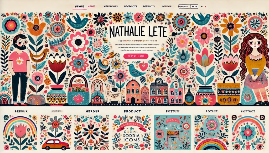
  • A hero banner showcasing Nathalie’s latest collection with a “Shop Now” call-to-action.
  • Dynamic sections featuring featured products, portfolio highlights, and blog updates.

Shop:

  • Enhanced filtering options (by category, collection, or theme).
  • High-quality product images with zoom functionality.

Portfolio:

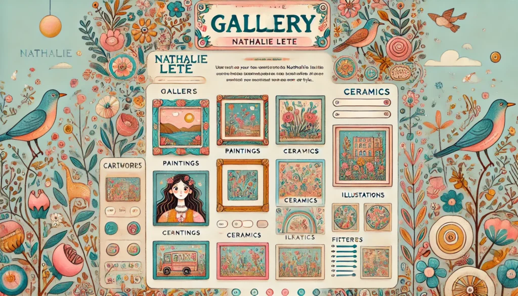
  • A visually rich gallery displaying her artwork categorized by medium (illustration, ceramics, textiles).

About:

  • A storytelling-driven section with Nathalie’s biography, milestones, and behind-the-scenes photos.

Blog:

  • Integrated Nathalie’s blog with storytelling content about her creative process and inspirations.


Outcomes

  1. Increased Engagement: Visitor time on site improved by 40% post-launch.
  2. Sales Boost: E-commerce conversion rate increased by 25%.
  3. Positive Feedback: Users praised the design for its creativity and improved navigation.
  4. Brand Alignment: The new design authentically represents Nathalie’s artistic identity.

Takeaways

  • Collaboration with stakeholders was key to capturing Nathalie’s unique aesthetic.
  • Prioritizing user feedback ensured the design met both functional and emotional needs.
  • Balancing creativity with usability created a design that resonates with users and reflects the artist’s brand.

Next Steps

  • Regularly update the site with new products and portfolio additions.
  • Introduce AR functionality for users to visualize products in their space.
  • Implement a newsletter sign-up to grow Nathalie’s community.

Project Status

  • The rebranding of Nathalie Lété’s official website is currently in the final stages of review and development. While the design and UX/UI improvements have been completed and approved, the updated website has not yet gone live. The project is now in collaboration with the development team to ensure all features are fully functional, optimized, and aligned with the brand vision.

    This case study reflects the completed design and strategic efforts, providing insight into the creative process and the potential impact of the new website once launched.