Founder · Visual identity · Illustration · Print design
Colour-loving individuals with a playful approach to everyday style.
Brand identity · Packaging concepts · Textile print
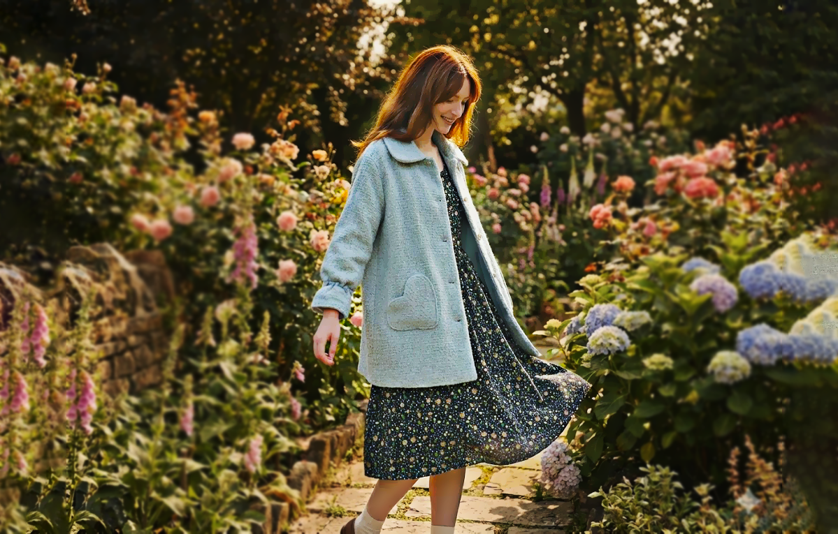
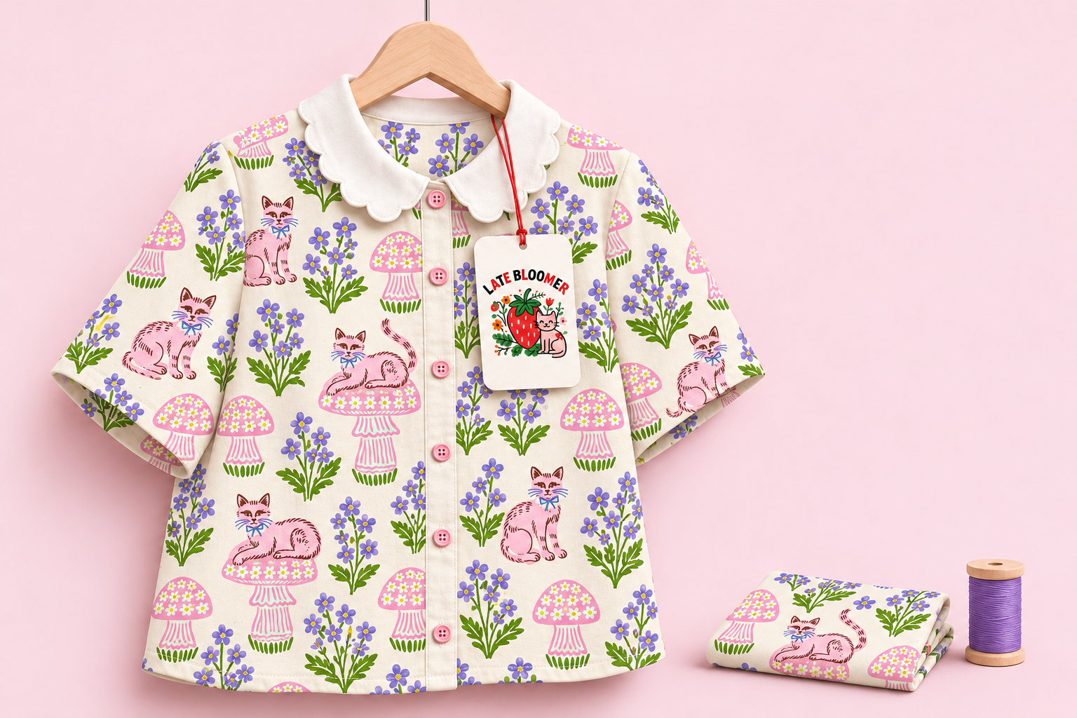
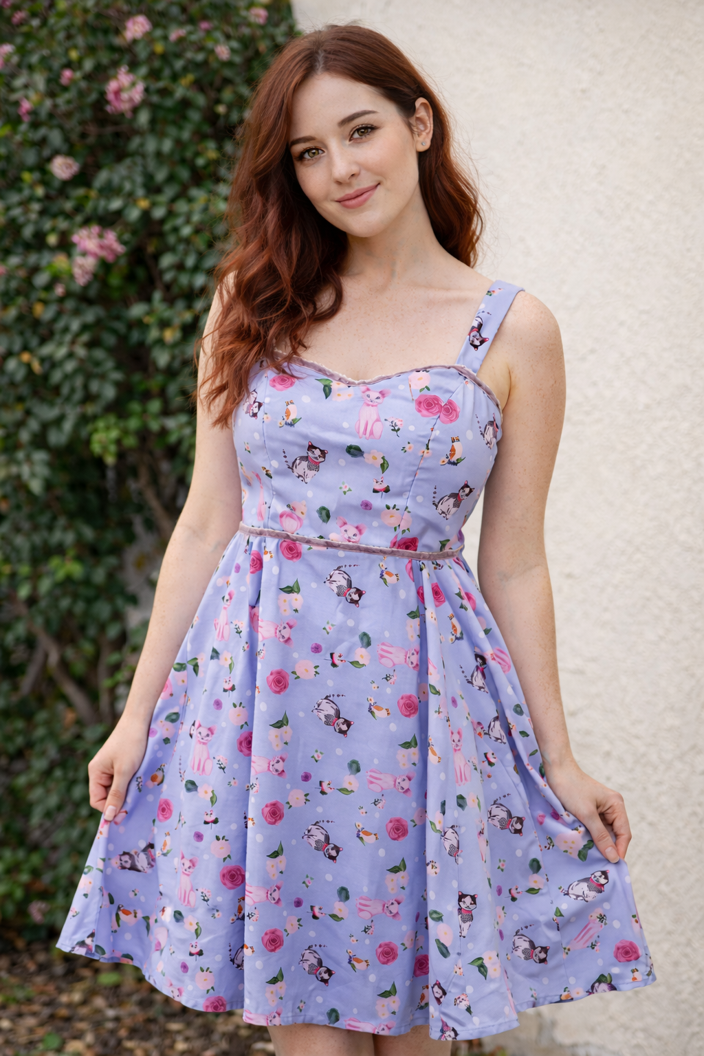
A garment I made, presented through styled imagery. This visual also anchors the website concept.
An independent brand celebrating individuality and growing at your own pace.
The name clicked while watching Only Murders in the Building, when I heard a character describe herself as a late bloomer. It captured something personal and became the starting point for the brand.
I imagined Late Bloomer for people who carry their playful side into everyday life, including what they wear to work. Vintage-inspired silhouettes, expressive prints, and small details create room for individuality in an everyday wardrobe.
The challenge was to build a coherent world around that personality, from the identity and garments to packaging and a digital shop concept.
For the website navigation, I developed a text-only wordmark treatment so the header stays compact and easy to scan.
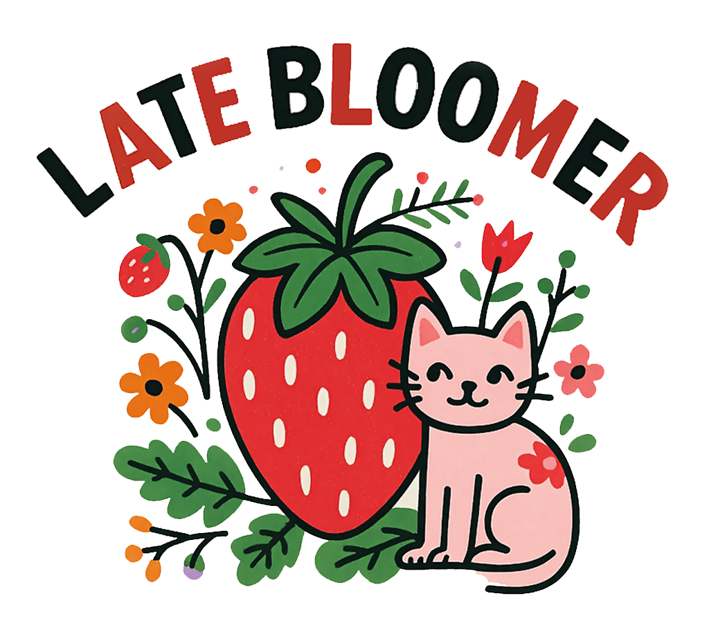
Energy and a recognisable accent.
A link to the botanical motifs.
Warmth, softness, and a playful touch.
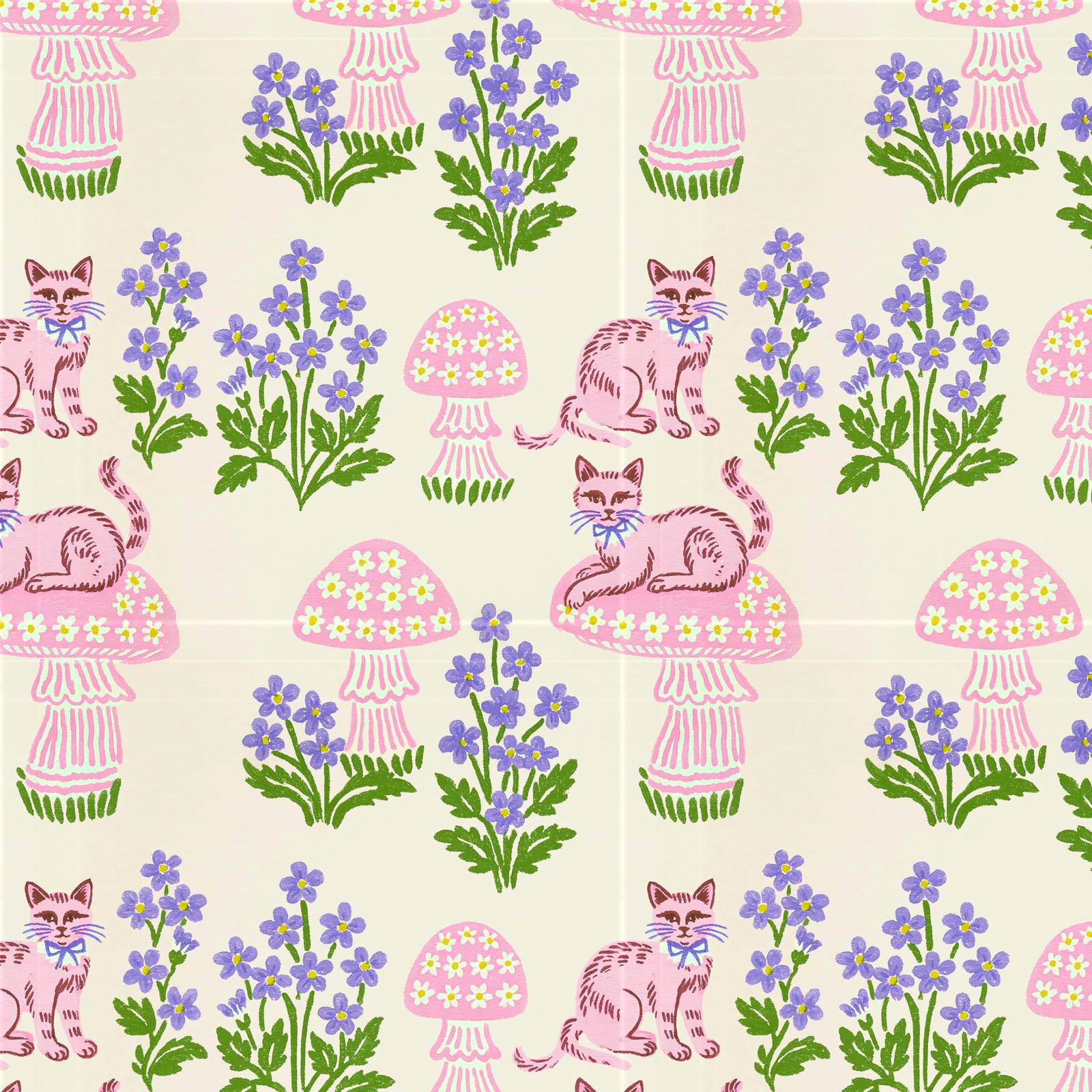
The blouse mockup explores how that print could read at garment scale, across seams, sleeves, and a button-front silhouette. It is a conceptual application of my print, rather than a manufactured item.
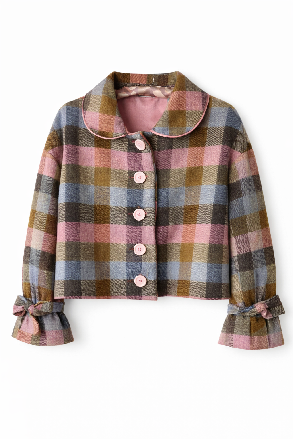
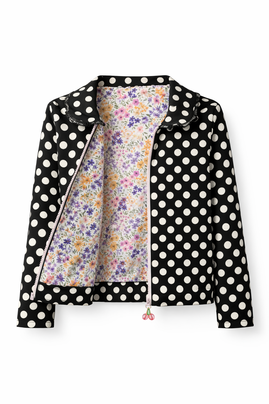
The garments shown here are pieces I sewed. Their silhouettes and construction details inform the brand’s art direction; not every fabric used in these garments is an original print of mine.
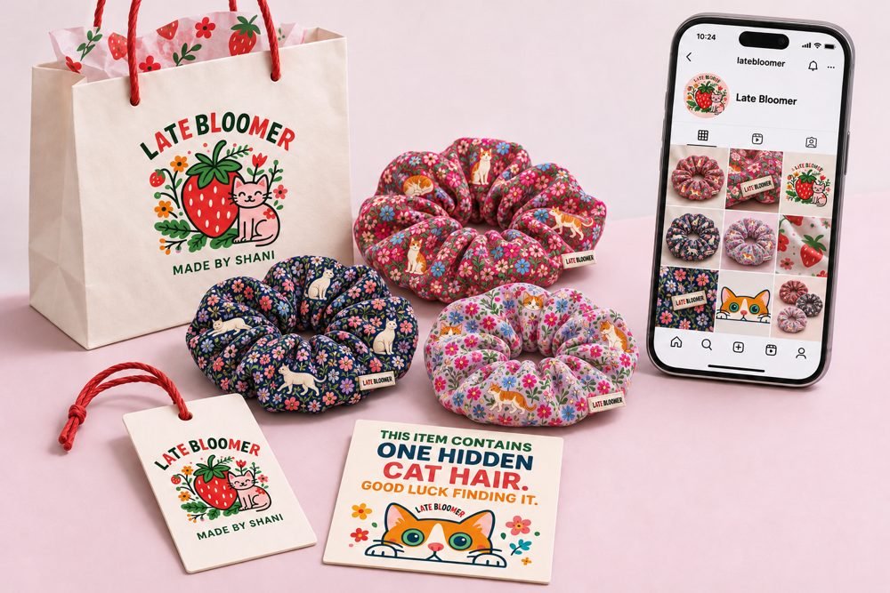
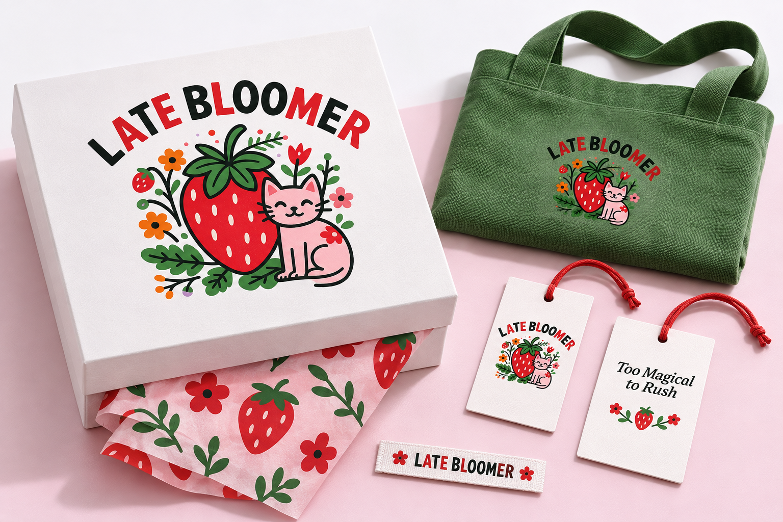
I explored how the identity could carry into the small physical touchpoints around a garment: a hangtag, woven label, tissue paper, tote, and gift packaging.
The concept uses the logo’s motifs and colours at different scales, connecting an expressive main mark with simpler supporting patterns and typographic details.
Packaging & label concepts · AI-assisted visualisation
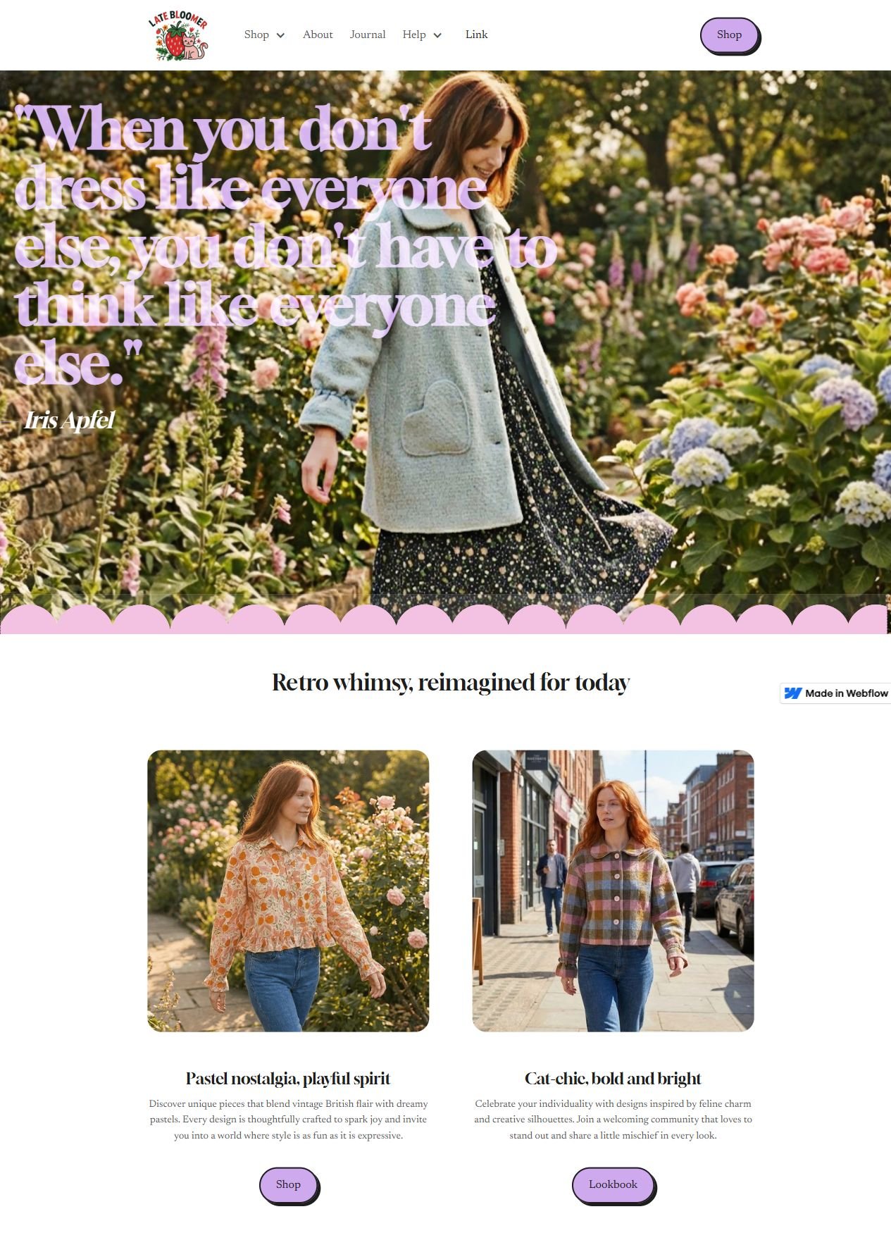
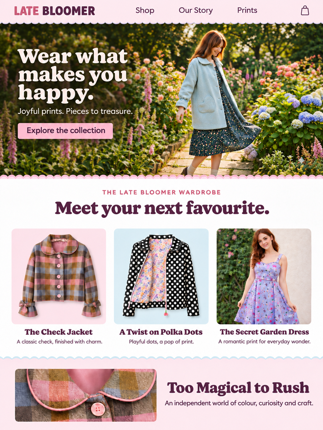
The digital concept translates the brand into a soft pastel boutique. A full-width garden image of the coat leads the homepage, with a text-only wordmark and a restrained navigation above it.
Scalloped borders echo the garment details. Rounded retro serif headings and a geometric sans-serif give Late Bloomer its own typographic voice. Product images and generous spacing keep the clothes central to the experience.
Late Bloomer connects the things I care about: illustration, colour, vintage-inspired silhouettes, sewing, and digital design. The case brings those disciplines into a single brand direction.
The next stage is to develop the digital concept into responsive page designs and refine the applications against real production requirements.
I created Late Bloomer as an independent clothing and print brand for people who like a little character in what they wear. Its idea is simple: good things bloom in their own time.

Visual identity

Supporting typography study
Original illustrated mark with supporting typography and palette.
Textile design


Web design & build · Webflow
Layout breakdown · Reconstructed from the design
The homepage introduces the mood of the brand, then offers two distinct ways to explore.
Homepage
The hero introduces the collection before asking visitors to choose a path.
Two entry points
The cards give product browsing and editorial discovery equal weight.